about.
As Centre communautaire Val-Martin prepared to relocate to the new Centre communautaire Simonne-Monet-Chartrand, the project called for more than a new logo. The challenge was to modernize Val-Martin's visual identity while preserving the recognition it had built within the community, create a complementary identity for the new community centre, and develop a cohesive brand system that could support both organizations across a wide range of print and digital communications.
Year
2024
Industry
Branding for Nonprofits
Client
Centre Communautaire Val-Martin
Brand Evolution.
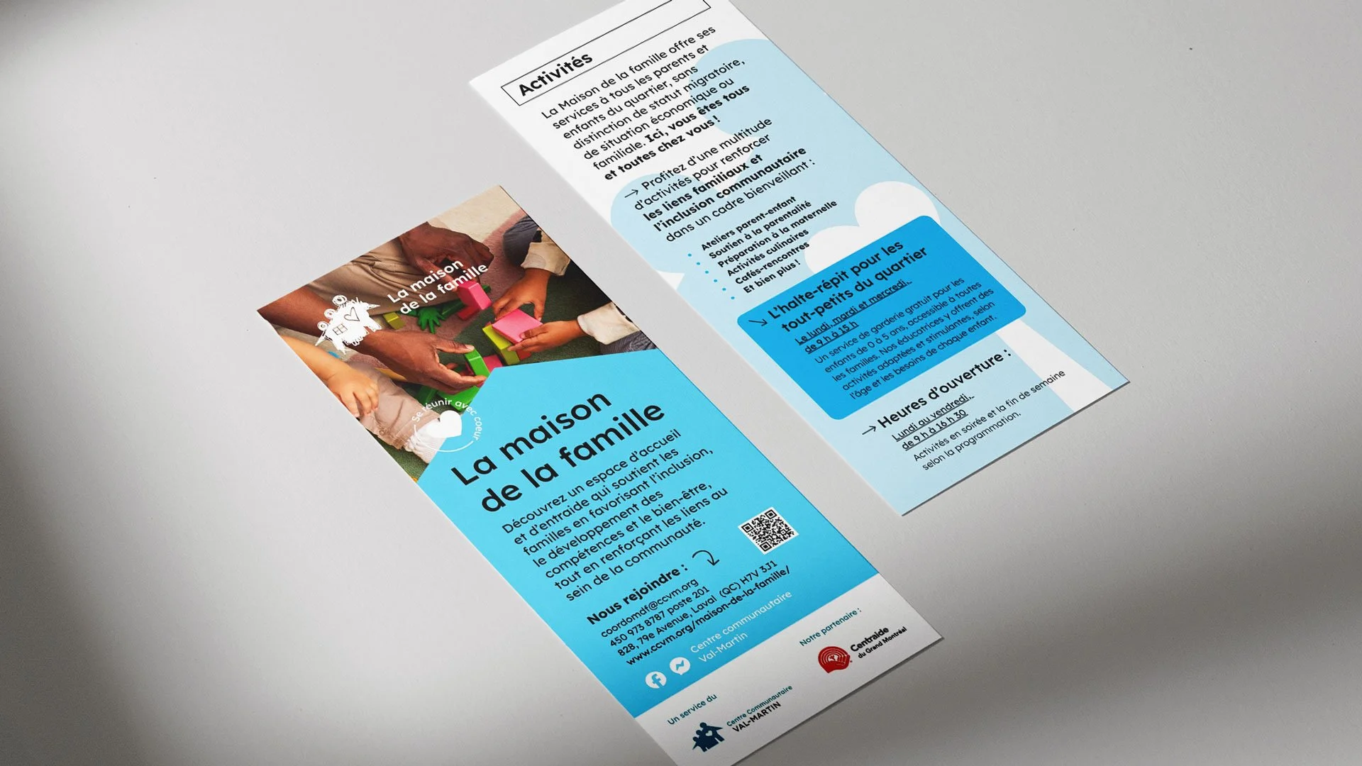
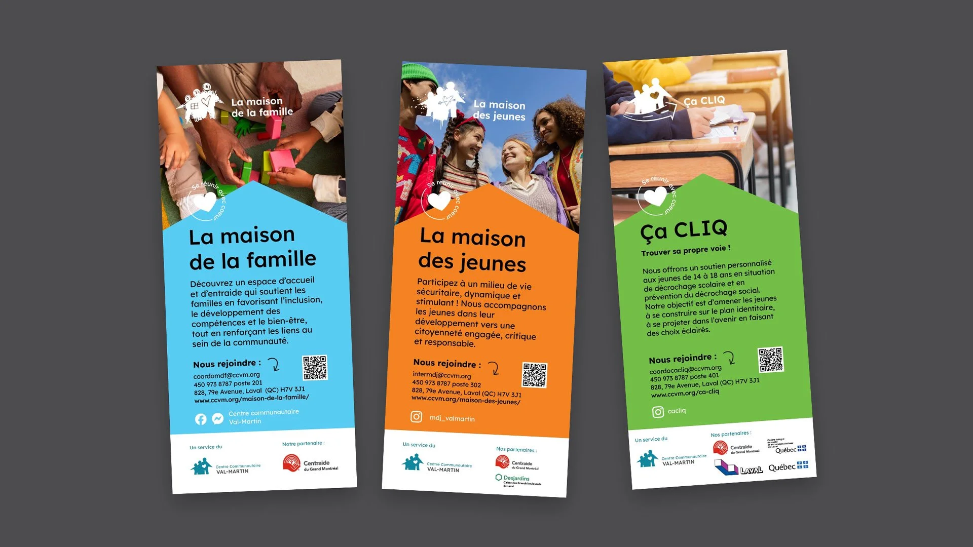
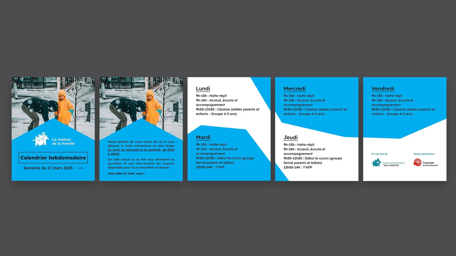
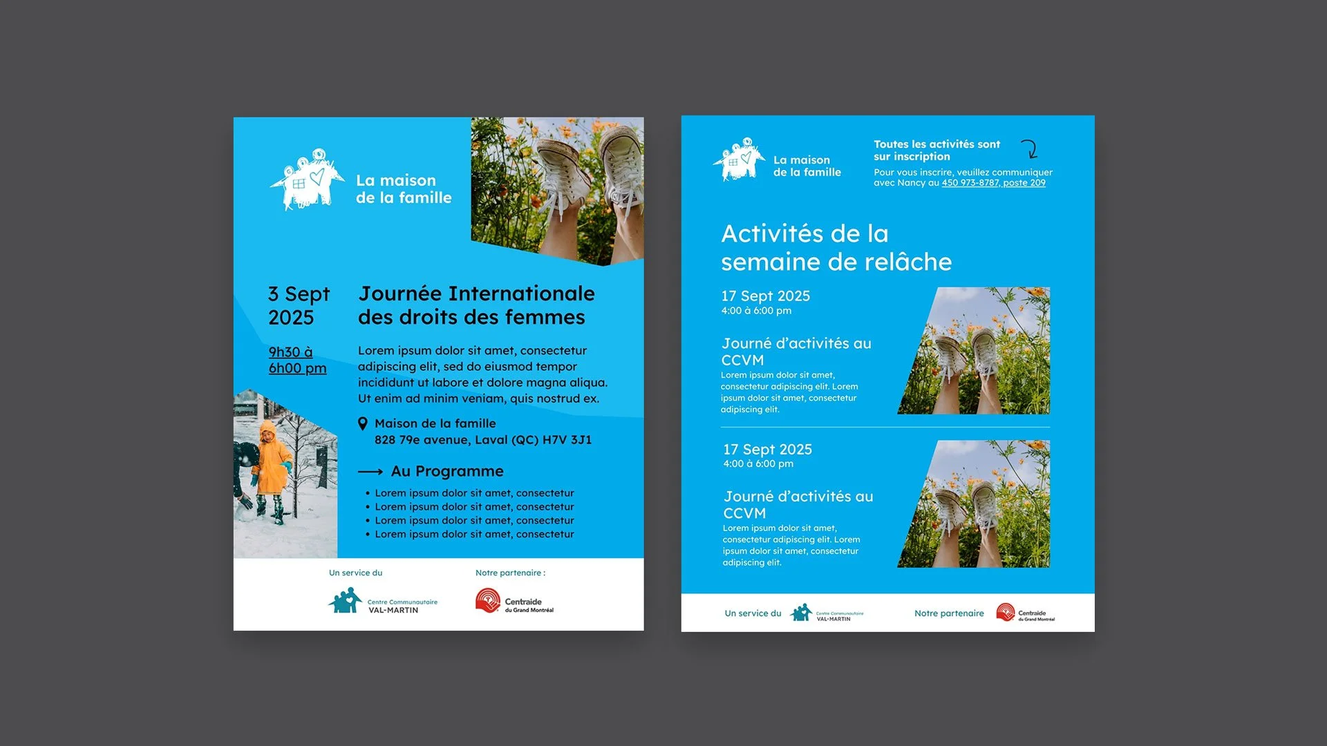
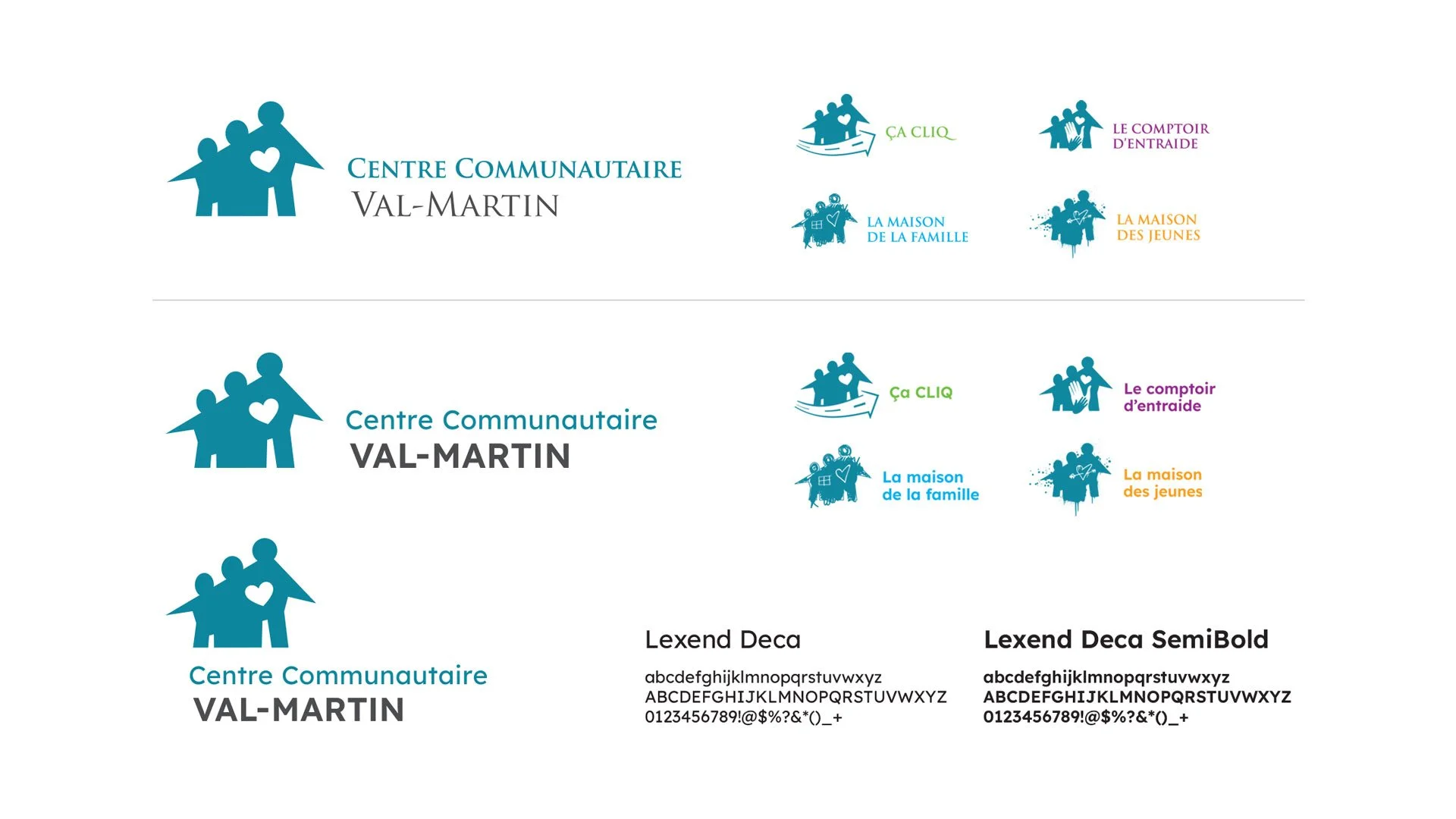
To preserve recognition, the original logo and colour palette were retained as the foundation of the identity, with updated typography to improve readability and modernize the visual language.
Lexend Deca was introduced as the primary typeface for both Val-Martin and CCSMC. Its friendly geometric structure and high legibility support accessible communication across diverse audiences, reinforcing clarity across both print and digital materials.
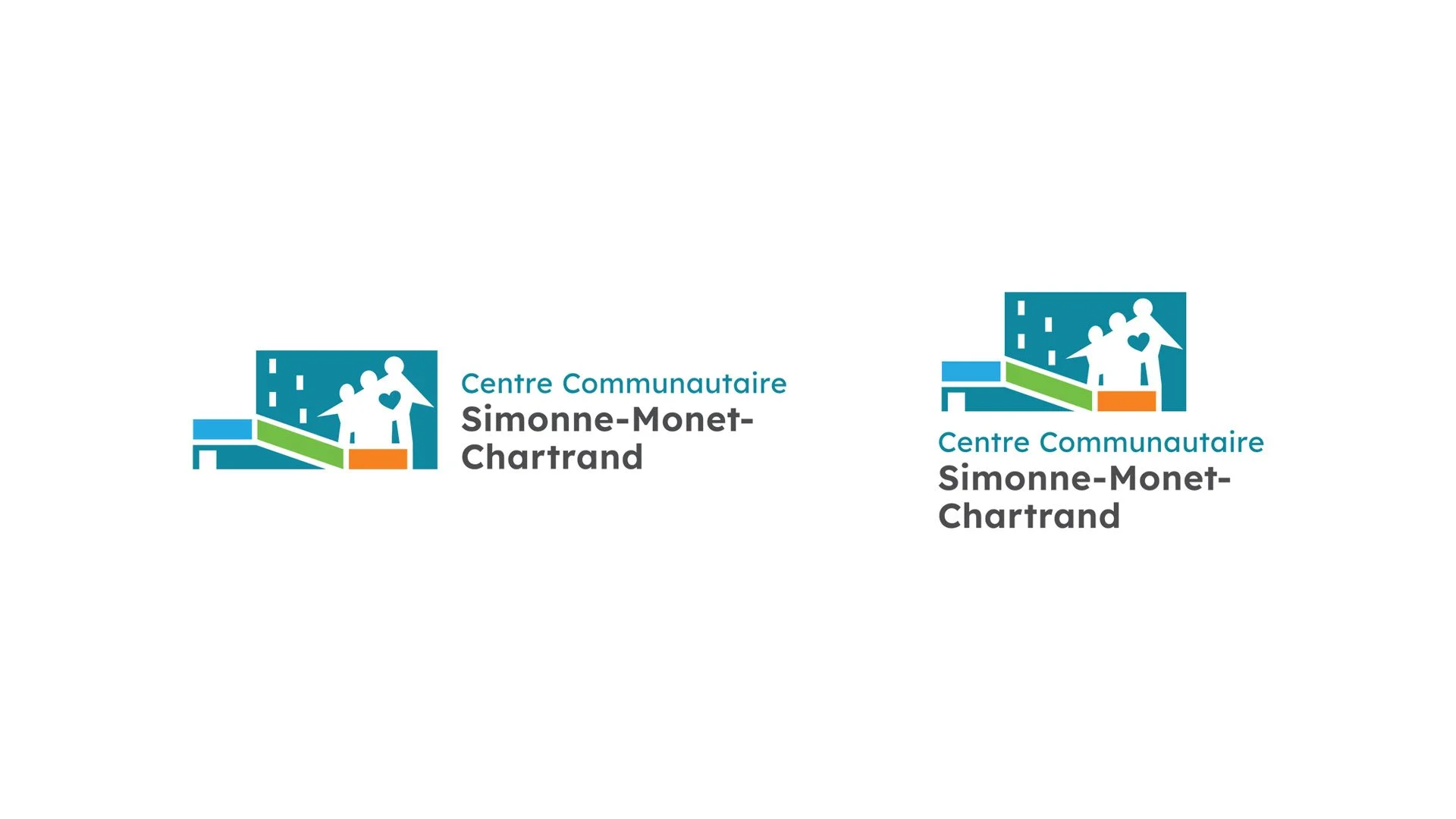
Creating a Second Identity.
To ensure visual continuity between the two organizations, I designed the CCSMC logo by integrating their symbol into the distinctive shape of their new building, while preserving the hand-cut aesthetic that defines their visual language. This approach maintains a cohesive identity while reflecting the CCSMC’s role as a new inclusive and community-centered space.
A modular template system was then developed to support consistent, flexible, and sustainable communications across both centres.