about.
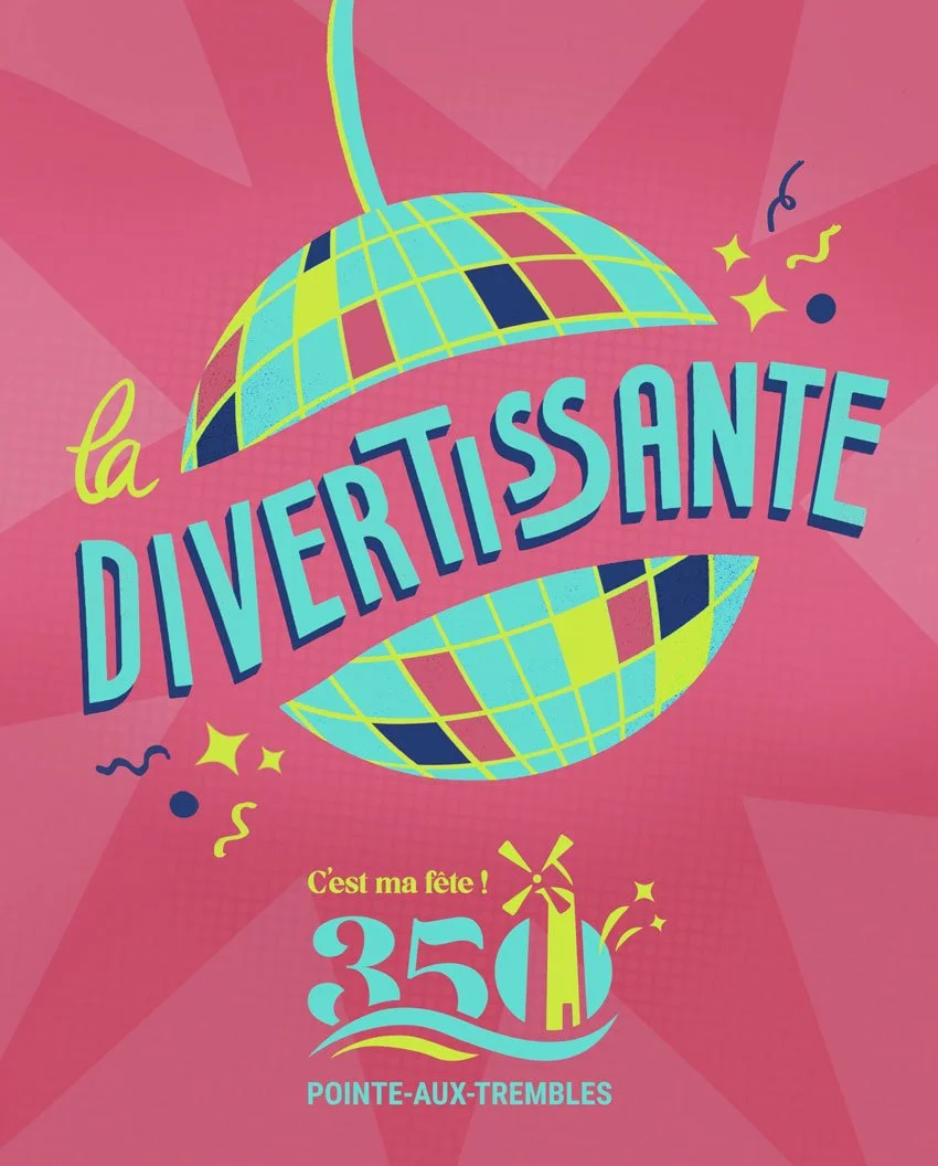
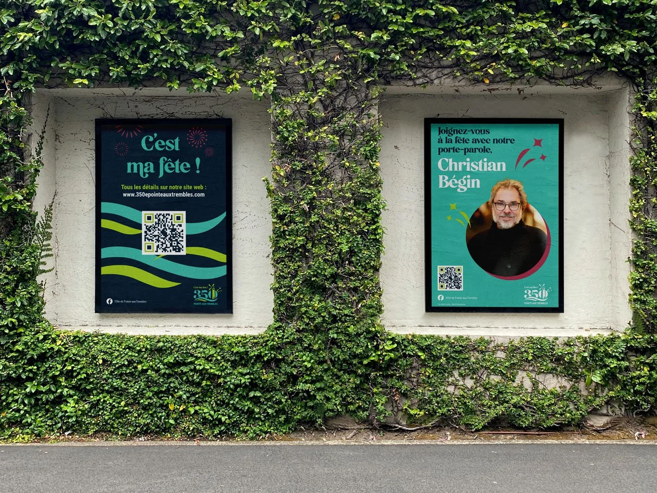
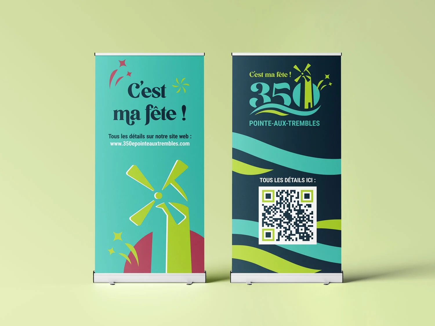
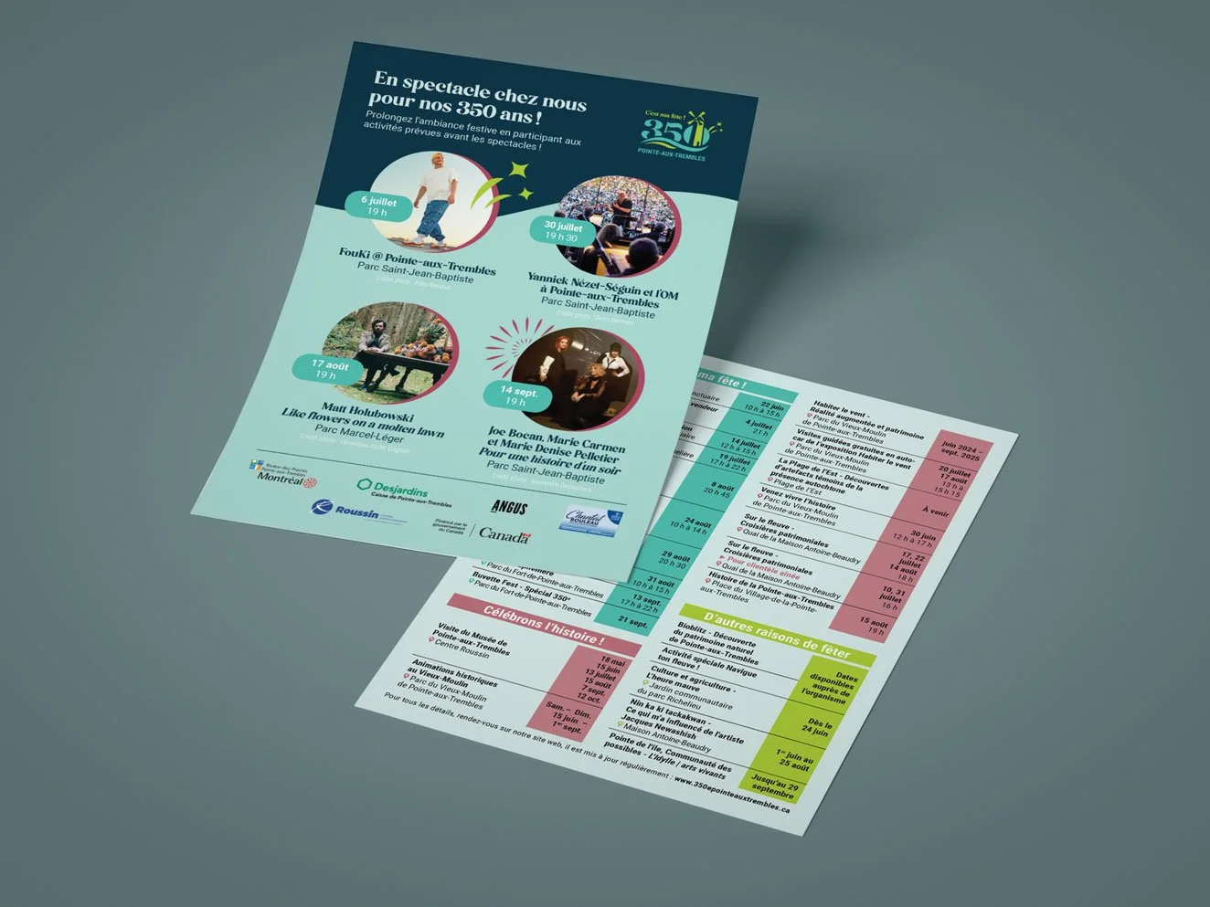
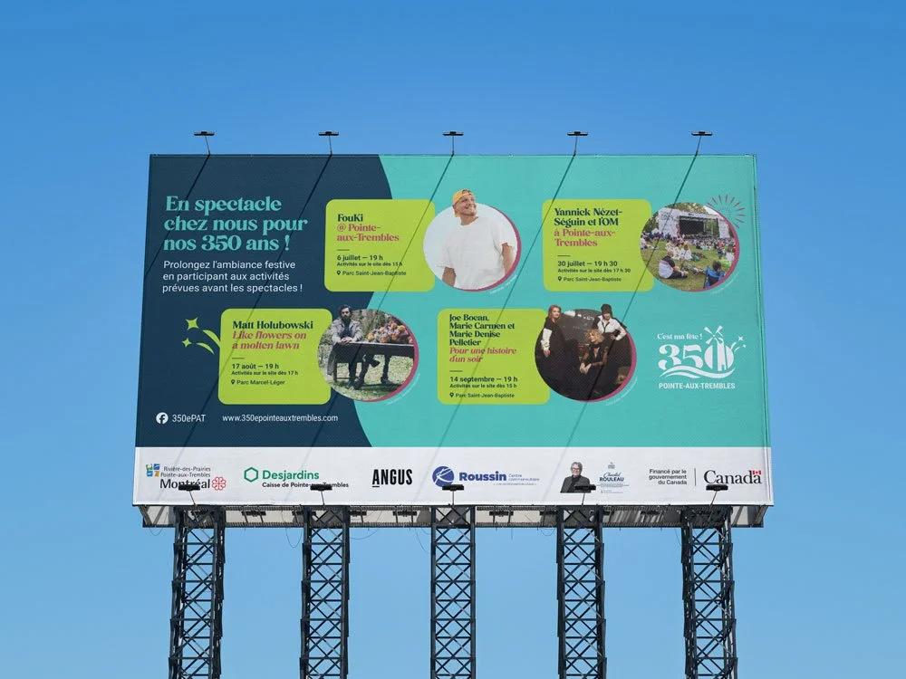
The logo for Pointe-Aux-Trembles’ 350th anniversary was created as a tribute to the community’s heritage and landscape. At its heart is the iconic windmill, a symbol of history and identity.
The two waves beneath the number highlight the harmony between the river and the land that surround the borough. Blue evokes the water, while green represents the parks and natural spaces that define Pointe-Aux-Trembles and make it such a unique place to call home.
Year
2023-2024
Industry
Event & Cultural Branding
Client
La Société Ressources-Loisirs de Pointe-Aux-Trembles
Made with
InDesign, Illustrator, Photoshop


Promotional Hot Sauce Label.
To mark the 350th anniversary, I designed the label for a limited-edition hot sauce in collaboration with MTHELL Hot Sauces, incorporating the festive theme to extend the celebration’s visual identity in a playful way.